
Ultimate Green Tech Dashboard

You’ve finally got all of your new toys connected to Home Assistant - you've automated your battery to respond to your solar and your heat pump can keep your home at sauna levels of warmth, but why does your dashboard look pants?! Well worry no more, this article will demo a number of cards and integrations to help inspire you to create your own ultimate green tech dashboard. Don't forget to check out the accompanying video too to see the dashboard in action.
Before I begin going through the details of each of the cards in the screenshot above, you should know that all of these cards require you to install third-party components. These are installed using the Home Assistant Community Store (HACS). Visit https://hacs.xyz and follow the instructions on there to get that installed. It's as easy as installing an add-on which will install the integration for you, and then linking it to a GitHub account (you will need to sign up for a free GitHub account).
Contents
- Solar Power Today vs Solar Forecast Graph
- Power Flow Card Plus
- Heat Pump Temperature Graph
- Ultra Vehicle Card
- Electricity Net Cost Graph
- Solar PV Forecast for Week Ahead
- Energy Use Today Sankey Chart
- Energy and Power Gauges
Solar Power Today vs Solar Forecast Graph
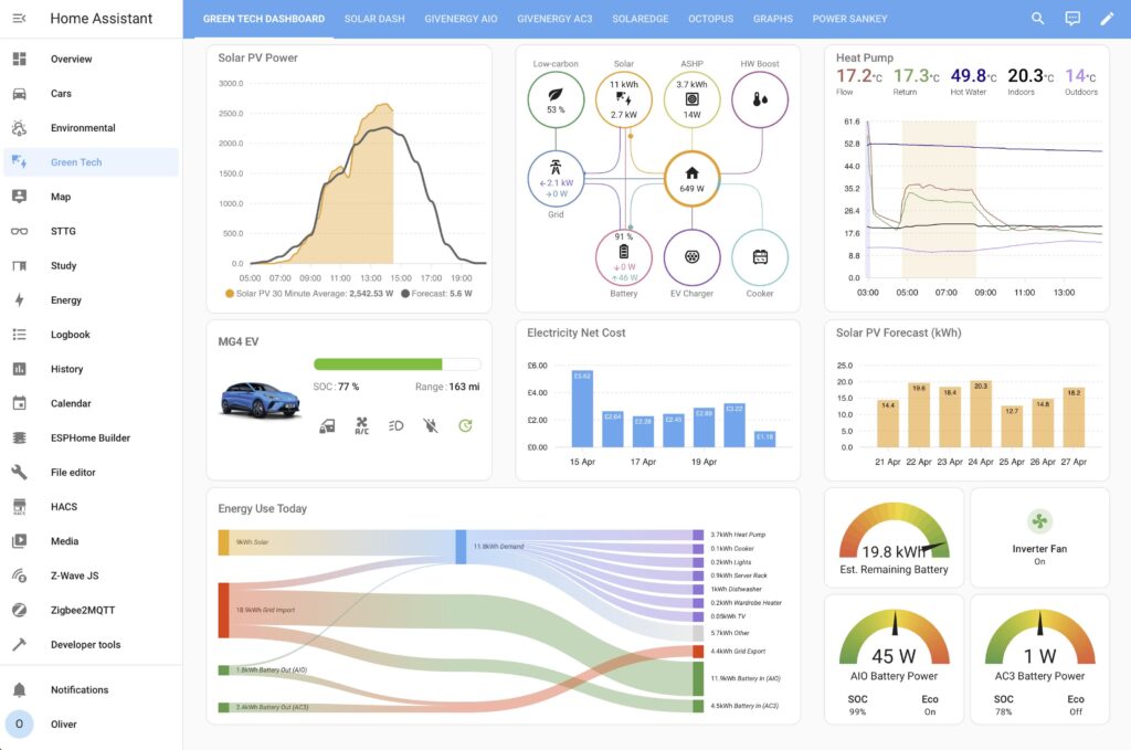
The Solar PV graph shows the forecasted power output for your solar PV installation over the course of the current day. Additionally it shows a 30-minute average for your actual PV generation so as you can see at a glance how your generation is performing compared to the forecast. This card requires you to be monitoring your solar PV installation in order to obtain a live power output reading from it, whether that is directly from your inverter via an integration with it, or using a third-party monitoring solution (such as a Shelly EM). You will also need to install and configure the Solcast integration and that involves signing up for a free Solcast account at https://solcast.com, defining your solar PV installation (array size, aspect, etc), and obtaining an API key to use. Once you have that set up you'll need to install the Solcast PV Solar Forecast Integration by BJReplay. The Solcast integration should give you a generation forecast for 7 days ahead and also a detailed forecast for the current day which is what we'll be using for this card.
And speaking of this card, it is created using the excellent ApexCharts Card by RomRider which provides you with a highly flexible if totally text-based-configurable graphing card. The card configuration is shown below - just replace 'sensor.YOUR_SOLARPV_POWER_ENTITY' with the actual sensor entity tracking your solar PV power.
type: custom:apexcharts-card
update_interval: 1min
apex_config:
  chart:
    foreColor: rgb(117, 117, 117)
    height: 335px
graph_span: 16h
span:
  start: day
  offset: +5h
header:
  show: true
  title: Solar PV Power
  standard_format: false
  show_states: true
series:
  - entity: sensor.YOUR_SOLARPV_POWER_ENTITY
    color: var(--energy-solar-color)
    name: Solar PV 30 Minute Average
    curve: smooth
    type: area
    opacity: 0.4
    float_precision: 2
    stroke_width: 2
    group_by:
      func: avg
      duration: 30min
      fill: zero
    extend_to: false
    show:
      in_header: false
      legend_value: true
  - entity: sensor.solcast_pv_forecast_forecast_today
    unit: W
    curve: smooth
    name: Forecast
    color: rgb(100, 100, 100)
    data_generator: |
      return entity.attributes.detailedForecast.map((entry) => {
        return [new Date(entry.period_start).getTime(), entry.pv_estimate*1000];
      });
    stroke_width: 3
    group_by:
      func: max
    show:
      in_header: false
      legend_value: true
Power Flow Card Plus

I love this card! And what's more is its configuration is now 100% GUI-driven so there's no need to dive into YAML at all anymore. Install the Power Flow Card Plus by flixlix via HACS (see https://github.com/flixlix/power-flow-card-plus ). You can define as few or as many power flows as you like and add up to four additional devices hanging off the 'Home' such as the cooker, EV charger, ASHP and HW Booster shown in this diagram. Provided you are monitoring a particular component's power consumption then you can add it. I use my Hildebrand Glow IHD to monitor the grid import/export, a direct integration with SolarEdge for my solar PV, GivTCP to monitor my GivEnergy batteries, and various third party power monitors for the other devices.
Carbon intensity can be monitored using the CO2 Signal sensor from the built-in Electricity Maps integration within Home Assistant, however if you are in the UK I suggest obtaining a more accurate regionally local value using this guide here: https://www.speaktothegeek.co.uk/2023/05/local-uk-grid-carbon-intensity-in-home-assistant/
Heat Pump Temperature Graph
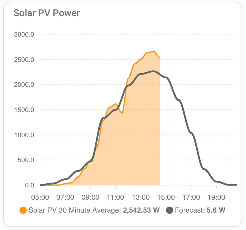
This graph is designed to mimic the look of the emoncms graphs. If you're not familiar with emoncms then check out my video on that here. I use emoncms to monitor all possible data emanating from my heat pump in order to keep track of its efficiency throughout the year, it produces amazingly clear graphs but the problem is you have to monitor them in a separate browser window. My Home Assistant card displays just the temperature components of that graph and also adds a background highlight so as you can easily see when the heating or hotwater cycles were running.
This card uses the ApexCharts Card again. Notice in the config below that there are a number of sensor names in ALL CAPS. Make sure you replace these with your actual sensor entity IDs. For the binary sensors, if you have these available and monitoring when your hot water cycle is running or if space heating is actively heating (I know the Octopus Energy API has these for the Cosy 6 heat pump, I have managed to cobble together template sensors to do this for my Daikin) then paste those in where appropriate too, or delete that section of the config if you don't have those sensors.
type: custom:apexcharts-card
header:
  show: true
  title: Heat Pump
  show_states: true
  colorize_states: true
apex_config:
  chart:
    height: 280px
  legend:
    show: false
graph_span: 12h
series:
  - entity: sensor.YOUR_FLOW_TEMPERATURE
    name: Flow
    stroke_width: 1
    yaxis_id: temp
    color: "#bc5450"
    group_by:
      duration: 10m
      func: last
  - entity: sensor.YOUR_RETURN_TEMPERATURE
    name: Return
    stroke_width: 1
    yaxis_id: temp
    color: "#65a558"
    group_by:
      duration: 10m
      func: last
  - entity: sensor.YOUR_HOT_WATER_CYLINDER_TEMPERATURE
    name: Hot Water
    stroke_width: 1
    yaxis_id: temp
    color: darkblue
    group_by:
      duration: 10m
      func: last
  - entity: sensor.YOUR_INDOOR_AIR_TEMPERATURE
    name: Indoors
    stroke_width: 1
    yaxis_id: temp
    color: black
    group_by:
      duration: 10m
      func: last
  - entity: sensor.YOUR_OUTDOOR_AIR_TEMPERATURE
    name: Outdoors
    stroke_width: 1
    yaxis_id: temp
    color: "#be83f8"
    group_by:
      duration: 10m
      func: last
  - entity: binary_sensor.IS_SPACE_HEATING_RUNNING
    name: CH
    type: area
    curve: stepline
    color: "#f5be74"
    stroke_width: 0
    opacity: 0.2
    transform: "return x === 'on' ? 1 : 0;"
    show:
      in_header: false
      legend_value: false
    yaxis_id: binary
  - entity: binary_sensor.IS_HOT_WATER_RUNNING
    name: DHW
    type: area
    curve: stepline
    color: "#8888f7"
    stroke_width: 0
    opacity: 0.2
    transform: "return x === 'on' ? 1 : 0;"
    show:
      in_header: false
      legend_value: false
    yaxis_id: binary
yaxis:
  - id: temp
    show: true
    min: 0
  - id: binary
    opposite: true
    show: false
    min: 0
    max: 1
Ultra Vehicle Card
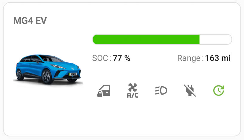
There are a number of flashy cards out there for displaying data from your car and presenting its controls. What I like about the Ultra Vehicle Card is that it provides you with a clean interface that's not out of place with other Home Assistant cards. It's also configured entirely by the GUI so no manual editing of configuration files is needed. As shown in my screenshot above you can add an image of your vehicle, a status bar (in my case it's showing the charge level), and rows of icons which can be both controls or information only / showing status. You can add multiple rows of icons and multiple bars if you wish, and the card can be arranged in two columns like I have here, or in a single column. All colours are fully customisable and the developer is actively maintaining the card through regular updates.
Electricity Net Cost Graph
This is an extremely useful / depressing card to have on your dashboard. It shows you how much you have spent (or will be billed) for each day of the last week for your energy usage. I'm showing just my electricity costs, which includes my daily standing charge and any income from exported electricity too. You can of course adapt this to include total energy costs with gas too if you like. This card is another ApexCharts Card and is very simple to set up, however before you can create the card you must make sure that you are collecting the required data. How you collect that data will very much vary depending on what physical components you have in your home and which energy provider you are with. I am with Octopus Energy and the Octopus Energy integration by BottlecapDave provides me with a useful 'accumulative costs' sensor for my imported energy that day, and the cost includes the standing charge.
Octopus Energy using my referral link:
speaktothegeek.co.uk/energy

Existing customer? Find out how you can benefit too. T&Cs apply (only one switching offer per household)
I created a template sensor named "Electricity Net Cost" with a unit of measurement "£", a device class of 'Balance' and a state class of 'Total'. The template I use is as follows:
{{ states('sensor.octopus_energy_electricity_xxxxxxxxxx_xxxxxxxxxxxxx_current_accumulative_cost')|float(0) - (states('sensor.octopus_energy_electricity_xxxxxxxxxx_xxxxxxxxxxxxx_export_current_rate')|float(0) * states('sensor.energy_export_daily')|float(0)) }}
I have censored my meter reference numbers of course, but you should be able to replace my entities with your own. In this template I take the current accumulative cost for my imported energy that day (which includes the standing charge), I then deduct from that what I earned from my exported energy. This is calculated by multiplying the rate I am paid for that energy (provided by the Octopus Energy integration) by the amount of energy I have exported. Unfortunately the Octopus API doesn't provide me with today's exported energy values so I have to use a separate sensor to provide that value. I actually use the data from my smart meter provided by my Hildebrand Glow IHD, but you could of course use any energy sensor that is monitoring your grid export which could be your home battery, solar inverter, or even EV charger (Zappi can do that for example...).
Once you have let that sensor collect some data for a few days then you are ready to create the card. If your entity is named 'Electricity Net Cost' exactly as I have named it, you should be able to copy and paste the following card configuration as-is. Otherwise, you'll need to edit the entity ID as appropriate.
type: custom:apexcharts-card
header:
  show: true
  title: Electricity Net Cost
  standard_format: false
  floating: false
apex_config:
  chart:
    height: 176px
  yaxis:
    labels:
      formatter: |
        EVAL:function(value) {
          return "£" + Number(value).toFixed(2);;
        }
  dataLabels:
    style:
      fontWeight: normal
      fontSize: 9px
    background:
      borderWidth: 0
      opacity: 0
      foreColor: white
      fontWeight: normal
    formatter: |
      EVAL:function(value) {
        return "£" + Number(value).toFixed(2);;
      }
  xaxis:
    tooltip:
      enabled: false
  tooltip:
    "y":
      formatter: |
        EVAL:function(value) {
          return "£" + Number(value).toFixed(2);;
        }
graph_span: 7d
span:
  end: day
series:
  - entity: sensor.electricity_net_cost
    type: column
    name: Electricity Net Cost
    group_by:
      func: last
      duration: 1d
    float_precision: 2
    color: var(--primary-color)
    show:
      datalabels: true
Solar PV Forecast for Week Ahead

This is one of the most useful cards I have - knowing the solar generation forecast for the week ahead. There are many ways to display this data of course, but a regular bar chart showing it day by day I think is the clearest. This is another ApexCharts Card of course, so make sure that's installed first. Then hopefully you have already installed and configured the Solcast integration that I discussed right at the start of this whole article. If you have those two things installed and ready to go then all you need to do is copy and paste my configuration below into a new card! Hopefully all of the entity IDs should match up with yours because I created this using all of the default options.
type: custom:apexcharts-card
header:
  show: true
  title: Solar PV Forecast (kWh)
graph_span: 7d
span:
  start: day
apex_config:
  chart:
    height: 176px
  dataLabels:
    style:
      fontWeight: normal
      fontSize: 9px
    background:
      borderWidth: 0
      opacity: 0
      foreColor: black
      fontWeight: normal
  xaxis:
    tooltip:
      enabled: false
series:
  - entity: sensor.solcast_pv_forecast_forecast_today
    name: PV
    type: column
    color: var(--energy-solar-color)
    opacity: 0.6
    group_by:
      func: last
      duration: 1d
    show:
      datalabels: true
    data_generator: |
      return [
          [moment().add(0, 'days'), hass.states['sensor.solcast_pv_forecast_forecast_today'].state],
          [moment().add(1, 'days'), hass.states['sensor.solcast_pv_forecast_forecast_tomorrow'].state],
          [moment().add(2, 'days'), hass.states['sensor.solcast_pv_forecast_forecast_day_3'].state],
          [moment().add(3, 'days'), hass.states['sensor.solcast_pv_forecast_forecast_day_4'].state],
          [moment().add(4, 'days'), hass.states['sensor.solcast_pv_forecast_forecast_day_5'].state],
          [moment().add(5, 'days'), hass.states['sensor.solcast_pv_forecast_forecast_day_6'].state],
          [moment().add(6, 'days'), hass.states['sensor.solcast_pv_forecast_forecast_day_7'].state]
        ]
Energy Use Today Sankey Chart

Sankey charts look very fancy. They're designed to show the flow of data from left to right and in this case I'm using it to show the sources of all my energy so far today on the left and where it ended up on the right. I've already put together a whole other video and article about the Sankey Chart card (see https://www.speaktothegeek.co.uk/2025/03/whole-home-energy-monitoring-with-home-assistant/ ) and in that example I used it to display live power usage in my home. I actually think that this card works best when displaying power, but I wanted to show an alternative in this example. The problem with displaying energy using this card is that whilst it knows the total values for each of the sources and destinations, it doesn't know what the split is between them. So in the screenshot above you can see that all of my solar generation went straight into the home for self-consumption. In reality that is not true because much of that self-consumption happened from the batteries before sunrise, and the solar generation during the day went straight out to the grid. But still, it gives you a rough idea and it looks good on the dashboard!
The Sankey Chart card is installed using HACS and you can find all of the documentation up on the card's GitHub page: https://github.com/MindFreeze/ha-sankey-chart
The card can pretty much now be completely configured using the GUI, so there's no need to dive into the YAML unless you really want to. However, in order for me to share the configuration of my card I'm going to need to provide you with the YAML! Hopefully it'll give you a good idea as to how I structured the entities and their various child entities. Note that I have also used the Card Mod integration in order to customise the CSS of the card on my dashboard - you can see that part at the end of the configuration example. Just install Card Mod via HACS if you wish to customise your layout in the same way.
title: Energy Use Today
layout: auto
height: 269
unit_prefix: k
round: 1
convert_units_to: ""
co2_intensity_entity: sensor.co2_signal_co2_intensity
gas_co2_intensity: 2351.6459999999997
min_box_size: 14
show_states: true
show_units: true
sections:
  - entities:
      - type: entity
        children:
          - sensor.home_energy_demand
          - sensor.smart_meter_electricity_energy_export
          - sensor.battery_energy_in
          - sensor.battery_ac3_energy_in
        entity_id: sensor.solar_pv_energy_today
        color: var(--warning-color)
        name: Solar
      - type: entity
        children:
          - sensor.home_energy_demand
          - sensor.battery_energy_in
          - sensor.battery_ac3_energy_in
        entity_id: sensor.smart_meter_electricity_energy_import
        name: Grid Import
        color: red
      - type: entity
        children:
          - sensor.home_energy_demand
          - sensor.smart_meter_electricity_energy_export
          - sensor.battery_ac3_energy_in
        entity_id: sensor.battery_energy_out
        color: var(--success-color)
        name: Battery Out (AIO)
      - type: entity
        children:
          - sensor.home_energy_demand
          - sensor.smart_meter_electricity_energy_export
          - sensor.battery_energy_in
        entity_id: sensor.battery_ac3_energy_out
        color: var(--success-color)
        name: Battery Out (AC3)
  - entities:
      - type: entity
        children:
          - sensor.ashp_energy_daily
          - sensor.shellypro3em_fce8c0d83374_em2_total_active_energy
          - sensor.ev_charger_total_energy
          - sensor.immersion_total_active_energy
          - sensor.lighting_energy
          - sensor.power_server_rack_energy
          - sensor.power_dishwasher_energy
          - sensor.power_tumble_dryer_energy
          - sensor.power_washing_machine_energy
          - sensor.wardrobe_heater_energy
          - sensor.tv_power_energy
          - other_stuff
        entity_id: sensor.home_energy_demand
        name: Demand
      - type: passthrough
        children: []
        entity_id: sensor.smart_meter_electricity_energy_export
        name: Grid Export
      - type: passthrough
        children: []
        entity_id: sensor.battery_energy_in
        color: var(--success-color)
        name: Battery In (AIO)
      - type: passthrough
        children: []
        entity_id: sensor.battery_ac3_energy_in
        color: var(--success-color)
        name: Battery In (AC3)
  - entities:
      - type: entity
        children: []
        entity_id: sensor.ashp_energy_daily
        name: Heat Pump
        color: MediumPurple
      - type: entity
        children: []
        entity_id: sensor.shellypro3em_fce8c0d83374_em2_total_active_energy
        name: Cooker
        color: MediumPurple
      - type: entity
        children: []
        entity_id: sensor.ev_charger_total_energy
        name: EV Charger
        color: MediumPurple
      - type: entity
        children: []
        entity_id: sensor.immersion_total_active_energy
        name: HW Immersion
        color: MediumPurple
      - type: entity
        children: []
        entity_id: sensor.lighting_energy
        name: Lights
        color: MediumPurple
      - type: entity
        children: []
        entity_id: sensor.power_server_rack_energy
        name: Server Rack
        color: MediumPurple
      - type: entity
        children: []
        entity_id: sensor.power_dishwasher_energy
        name: Dishwasher
        color: MediumPurple
      - type: entity
        children: []
        entity_id: sensor.power_tumble_dryer_energy
        name: Tumble Dryer
        color: MediumPurple
      - type: entity
        children: []
        entity_id: sensor.power_washing_machine_energy
        name: Washing Machine
        color: MediumPurple
      - type: entity
        children: []
        entity_id: sensor.wardrobe_heater_energy
        name: Wardrobe Heater
        color: MediumPurple
      - type: entity
        children: []
        entity_id: sensor.tv_power_energy
        name: TV
        color: MediumPurple
      - type: remaining_parent_state
        children: []
        entity_id: other_stuff
        name: Other
        color: lightgrey
      - type: entity
        children: []
        entity_id: sensor.smart_meter_electricity_energy_export
        name: Grid Export
        color: red
      - type: entity
        children: []
        entity_id: sensor.battery_energy_in
        color: var(--success-color)
        name: Battery In (AIO)
      - type: entity
        children: []
        entity_id: sensor.battery_ac3_energy_in
        color: var(--success-color)
        name: Battery In (AC3)
time_period_from: now/d
show_names: true
type: custom:sankey-chart
min_state: 0
wide: true
grid_options:
  columns: full
  rows: auto
card_mod:
  style:
    .: |
      ha-card {
        font-size: 9px;
      }
    $: |
      .card-header {
        color: var(--secondary-text-color) !important;
        font-size: 16px !important;
        font-weight: 500 !important;
        padding-top: 5px !important;
        padding-bottom: 5px !important;
      }
Energy and Power Gauges
And lastly we come to a bit of filler on the dashboard. Firstly in the top-left I have a gauge showing my remaining battery capacity in kWh. This is simply displaying the value of a template sensor calculated by multiplying my known battery capacity (in kWh) by the remaining SOC percentage.
Second up there's a little fan status icon showing whether the fan cooling my solar inverter is on or off. It serves no real practical purpose but I like to know its status! This card is created using Mushroom Cards.
And then underneath those are some battery power gauges. I have two home batteries and I find it useful to see the status of each of them separately. These cards are actually an amalgamation of three separate cards, all brought together using 'Stack in Card'. To create these hybrid cards you will need the following to be installed via HACS:
type: custom:stack-in-card
mode: vertical
keep:
  margin: false
cards:
  - type: gauge
    entity: sensor.givtcp_xxxxxxxxxx_battery_power
    min: -3600
    max: 3600
    needle: true
    name: AIO Battery Power
    segments:
      - from: -3600
        color: "#44A047"
      - from: -3507.69
        color: "#48A145"
      - from: -3415.38
        color: "#4DA243"
      - from: -3323.08
        color: "#52A442"
      - from: -3230.77
        color: "#57A540"
      - from: -3138.46
        color: "#5BA73F"
      - from: -3046.15
        color: "#60A83D"
      - from: -2953.85
        color: "#65A93B"
      - from: -2861.54
        color: "#6AAB3A"
      - from: -2769.23
        color: "#6EAC38"
      - from: -2676.92
        color: "#73AE37"
      - from: -2584.62
        color: "#78AF35"
      - from: -2492.31
        color: "#7DB033"
      - from: -2400
        color: "#82B232"
      - from: -2307.69
        color: "#86B330"
      - from: -2215.38
        color: "#8BB52F"
      - from: -2123.08
        color: "#90B62D"
      - from: -2030.77
        color: "#95B72B"
      - from: -1938.46
        color: "#99B92A"
      - from: -1846.15
        color: "#9EBA28"
      - from: -1753.85
        color: "#A3BC27"
      - from: -1661.54
        color: "#A8BD25"
      - from: -1569.23
        color: "#ACBF24"
      - from: -1476.92
        color: "#B1C022"
      - from: -1384.62
        color: "#B6C120"
      - from: -1292.31
        color: "#BBC31F"
      - from: -1200
        color: "#C0C41D"
      - from: -1107.69
        color: "#C4C61C"
      - from: -1015.38
        color: "#C9C71A"
      - from: -923.08
        color: "#CEC818"
      - from: -830.77
        color: "#D3CA17"
      - from: -738.46
        color: "#D7CB15"
      - from: -646.15
        color: "#DCCD14"
      - from: -553.85
        color: "#E1CE12"
      - from: -461.54
        color: "#E6CF10"
      - from: -369.23
        color: "#EAD10F"
      - from: -276.92
        color: "#EFD20D"
      - from: -184.62
        color: "#F4D40C"
      - from: -92.31
        color: "#F9D50A"
      - from: 0
        color: "#FED709"
      - from: 92.31
        color: "#FED30A"
      - from: 184.62
        color: "#FECF0B"
      - from: 276.92
        color: "#FECB0C"
      - from: 369.23
        color: "#FEC80E"
      - from: 461.54
        color: "#FEC40F"
      - from: 553.85
        color: "#FEC010"
      - from: 646.15
        color: "#FEBC11"
      - from: 738.46
        color: "#FEB913"
      - from: 830.77
        color: "#FEB514"
      - from: 923.08
        color: "#FEB115"
      - from: 1015.38
        color: "#FEAD16"
      - from: 1107.69
        color: "#FEAA18"
      - from: 1200
        color: "#FEA619"
      - from: 1292.31
        color: "#FEA21A"
      - from: 1384.62
        color: "#FE9E1B"
      - from: 1476.92
        color: "#FE9B1D"
      - from: 1569.23
        color: "#FE971E"
      - from: 1661.54
        color: "#FE931F"
      - from: 1753.85
        color: "#FE8F20"
      - from: 1846.15
        color: "#FE8C22"
      - from: 1938.46
        color: "#FE8823"
      - from: 2030.77
        color: "#FE8424"
      - from: 2123.08
        color: "#FE8025"
      - from: 2215.38
        color: "#FE7D27"
      - from: 2307.69
        color: "#FE7928"
      - from: 2400
        color: "#FE7529"
      - from: 2492.31
        color: "#FE712A"
      - from: 2584.62
        color: "#FE6E2C"
      - from: 2676.92
        color: "#FE6A2D"
      - from: 2769.23
        color: "#FE662E"
      - from: 2861.54
        color: "#FE622F"
      - from: 2953.85
        color: "#FE5F31"
      - from: 3046.15
        color: "#FE5B32"
      - from: 3138.46
        color: "#FE5733"
      - from: 3230.77
        color: "#FE5334"
      - from: 3323.08
        color: "#FE5036"
      - from: 3415.38
        color: "#FE4C37"
      - from: 3507.69
        color: "#FE4838"
      - from: 3600
        color: "#FF453A"
    card_mod:
      style: |
        ha-card {
          border: none;
          margin-bottom: -20px;
        }
  - type: grid
    columns: 2
    square: false
    cards:
      - type: custom:mushroom-entity-card
        entity: sensor.givtcp_xxxxxxxxxx_soc
        name: SOC
        layout: vertical
        icon_type: none
        tap_action:
          action: more-info
        primary_info: name
        secondary_info: state
        card_mod:
          style: |
            ha-card {
              border: none;
            }
      - type: custom:mushroom-entity-card
        entity: switch.givtcp_xxxxxxxxxx_eco_mode
        name: Eco
        layout: vertical
        icon_type: none
        tap_action:
          action: more-info
        primary_info: name
        secondary_info: state
        icon_color: green
        card_mod:
          style: |
            ha-card {
              border: none;
            }
The above example is for just one of those hybrid cards - you'll need to change the entity IDs of any entities to your own of course if you plan to use this design.
You might have also noticed the very fancy looking gradient colour effect on the gauges. The configuration for those gradients was generated using the amazing HA Rainbow Generator website. You can access that here: https://ha.labtool.pl